ARCADIA
Digital Concept Product: Investment Management Platform
Role: UX/UI Designer & Researcher / Content Designer / Brand Designer
Tools: Figma, FigJam, Adobe Illustrator, Adobe Photoshop, Adobe After Effects

Brief Project Overview
Arcadia is a concept investment management platform that unifies UX strategy, UI design, and brand identity to simplify how users visualize and manage their portfolios. Designed to bring clarity, confidence, and control to the financial experience, Arcadia translates complex data into an intuitive, emotionally resonant interface.
The UX process began with persona development, journey mapping, and user flow exploration to define user pain points and behaviors. Insights informed the platform’s clean information hierarchy, effortless navigation, and interactive data visualizations that empower users to make confident financial decisions.
The brand strategy centers on empowerment through design — communicated through three visual narratives:
-
“Invest with confidence” conveys balance and calm through nature-based imagery.
-
“Your intelligent edge” reflects Arcadia’s integration of AI-driven insights.
-
The core slogan, “Take Control,” anchors the brand’s message of focus and independence.
As the lead UX/UI and Brand Designer, I developed Arcadia’s logo, color palette, typographic system, and motion prototypes in After Effects, ensuring that every visual and interaction reinforced the brand’s tone of sophistication and trust.
This project showcases my ability to merge strategic UX thinking with cohesive brand and interface design — creating a seamless digital experience that feels both intelligent and human-centered.

Full Case Study
Problem Statement
Managing stocks, crypto, and savings across multiple platforms leaves investors without a clear, real-time view of their financial health. This fragmentation creates frustration, disorganization, and uncertainty in decision-making.
Goal Statement
Arcadia aims to unify these assets into one intuitive platform with a personalized dashboard. By simplifying transactions, visualizing performance, and streamlining reports, Arcadia helps investors access insights quickly and act with greater confidence.
Research & Understanding
To ground the design process, I created a persona representing Arcadia’s target user: Ethan Parker, 32, a software engineer and casual investor. Ethan manages both stocks and crypto but struggles with fragmented tools like separate apps and spreadsheets. His goals are to track performance, access reports quickly, and feel more confident in his financial decisions. His frustrations include switching between platforms, cluttered interfaces, and information overload.
Persona

User Journey
Ethan’s journey highlights the need for a unified investment platform:
-
Need: Wants a clear, consolidated view of his assets.
-
Search: Looks for solutions that combine stocks, crypto, and savings.
-
Onboard: Signs up and links accounts with minimal effort.
-
Use: Checks his dashboard daily for balance, allocation, and performance trends.
-
Manage: Reviews transactions and downloads reports with ease.
-
Reflect: Feels more confident and in control of his financial health.
This journey illustrates how Arcadia reduces friction, shifting the user’s experience from disorganized and uncertain to streamlined and confident.

Information Architecture
To structure Arcadia, I created an information architecture (IA) map that organizes the platform into five core sections. The goal was to keep navigation intuitive and ensure that users could access high-value information—like portfolio performance and transactions—without unnecessary friction.
Core Sections:
-
Dashboard: Central hub with total balance, performance charts, asset allocation, quick actions, and recent activity.
-
Portfolio: Breakdown of stocks, crypto, and savings, with drill-down details and allocation views.
-
Transactions: Complete history with filters and export options.
-
Reports & Insights: Monthly, quarterly, and annual reports with trend highlights.
-
Profile & Settings: Account information, linked accounts, security, preferences, and notifications.
This structure reflects Ethan’s needs by prioritizing clarity and efficiency. The dashboard serves as the anchor, while supporting sections provide depth and flexibility for managing assets.

Note on Wireframes
Unlike some of my other projects, Arcadia was approached directly in high-fidelity. Since the goal of this case study was to showcase strong UI design and data visualization, I intentionally skipped low-fidelity wireframes. This allowed me to focus early on typography, hierarchy, and visual balance to demonstrate how design can simplify complex financial data.
Design Exploration
Brand Identity
The Arcadia brand was built to evoke trust, clarity, and modern sophistication within the world of finance. I designed a clean, minimal identity system that balances technical precision with a sense of calm through muted tones, structured typography, and atmospheric imagery. The logo and color palette reinforce confidence and focus, while the overall art direction bridges data with emotion — helping users feel informed, not overwhelmed.
This identity extends across product UI, marketing visuals, and dashboard applications, creating a cohesive experience that feels both professional and approachable.

The landing page introduces Arcadia with a clear value proposition: unifying stocks, crypto, and savings in one modern platform. Each art directed section highlights a key benefit — clear insights, investing with confidence, and AI-assisted guidance — supported by a dark, minimalist visual style that reflects trust and professionalism in fintech. (Please see video above to view motion design element I created in Adobe After Effects to attract users on initial site entrance).
Landing Page

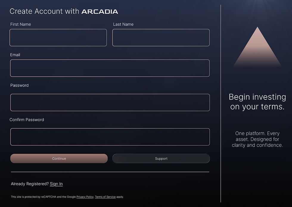
Sign In / Sign Up
The authentication flow was designed to be minimal and approachable. The sign-up page sets the tone with aspirational copy — “Begin investing on your terms.” — and a streamlined form that reduces friction for new users. The design emphasizes clarity and accessibility, with high-contrast fields and strong CTAs to guide users forward.

Dashboard
The dashboard is the centerpiece of Arcadia. It provides investors with a clear overview of their financial health, including total balance, investment breakdowns, token allocation, quick actions, and an asset list with live prices. The focus was on balancing density of information with visual hierarchy, ensuring that critical insights are immediately visible without overwhelming the user.

Next Steps
Arcadia is an ongoing concept project, and the assets shown represent the work completed so far in the process. The next phase of design will expand beyond the core dashboard and onboarding screens to include:
-
Portfolio Detail Pages with drill-down views for stocks, crypto, and savings.
-
Transaction Flows for deposits, withdrawals, and transfers.
-
Reporting & Insights with customizable exports and trend highlights.
-
Mobile Adaptation to explore how Arcadia’s structure translates to smaller screens.
-
Usability Testing (Conceptual) to validate whether the current design supports clarity, efficiency, and user confidence.
These steps will bring greater depth to the Arcadia platform and provide more opportunities to refine both the user experience and the visual design system.